Creating User Journeys for Your IoT Dashboard
Creating User Journeys for Your IoT Dashboard
- Last Updated: December 2, 2024
Shahrzad Darafsheh
- Last Updated: December 2, 2024

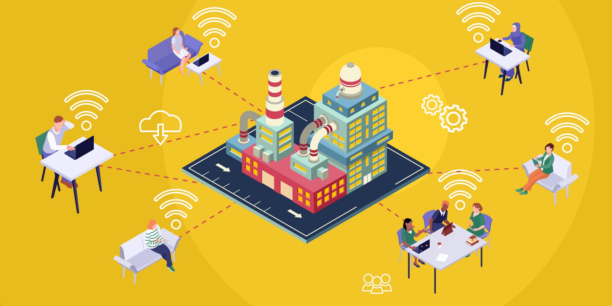
How you display information is critical to the success of your IoT deployment. If the data you're collecting can't be quickly parsed and utilized, it's basically useless. In my last article, I gave four steps for designing a valuable dashboard for any IoT project. In this article, I'll be diving deeper into creating user journeys for your IoT dashboard.
For the next set of posts, we will be using the previous example Applications that was discussed in the previous post, designing a mobile application for a smart fridge that includes a dashboard along with several other key pages.
In this week’s post, we will walk through the initial steps of a project, which include: researching, creating a priority list of features for our mobile app, and creating user personas/user journeys. Finally, we will be combining all of the information that we have collected to create a flowchart.
1. General Research
As I have mentioned before, the very first step to any project is research so that we can gain a better understanding of what the hardware’s capabilities are. Of course, if this were a real project, we would talk to the client and ask them to provide us a document that includes all of the information on their product, along with what capabilities they would want the software to contain. However, since this is not a real project, I went ahead and did some extra digging to help aid our work process.
Based on my research, smart fridges can have a range of capabilities including a variety of different temperature controls, status updates on temperatures and alerts, Wifi-connected cameras that allow the buyer to track their supplies, bar-code scanners to aid in the identification of expiration dates and product inventory, or an entertainment system with built-in stereos that allows you to control your music, recipes, messages, groceries, etc.
A great example of a fridge with all of these capabilities and then some is the Samsung Smart Family Hub Fridge which was presented at the CES conference in 2016. For the purposes of this exercise, we will use this fridge as our inspiration.
2. Priority Features
Now that we have done the preliminary research, and taken a look at the competition out there, its time to list out the basic features we want to include in our app. In order to keep track of the most important features, we must first make a priorities list of each feature.
- Camera image of fridge - With list of all supplies per compartment (inventory page)
- Barcode Scanner
- Alerts and Notifications
- Settings Page - set thresholds for alerts and notification preferences
- Dashboard of some analytics/data/important information
- Media Control (this can be included with the next point)
3. The User Journey Through the App
We are finally ready to put our knowledge to the test and think through the user experience and the user journey. Let’s create a couple different user demographics to set the mood.
User 1: John Williams
- Male
- 35 Years Old
- Married
- 2 kids, 2 pets
John lives a very fast-paced life, enjoys spending time with his family, and primarily uses the mobile app to help speed up the grocery shopping experience. He loves having the ability to look at his supplies right on his phone as it saves him time and energy.
User 2: Kathy Scott
- Female
- 29 Years Old
- Single
- 1 dog
Kathy is an athletic, well educated, single woman who is very career oriented, and you would rarely find her relaxing at home. She loves to be in control and prefers having a smart fridge as it helps her keep track of her food when she’s not home.
Based on the information that we have right now, our user journey may go something like this:
User logs in (this would be a one time log in per device, unless the user decides to log out) —> User gets directed to the dashboard that presents analytics, fridge and freezer temps, weather, media control connected to a music app such as Spotify.
From the dashboard, the user can use the navigation menu to navigate to the Alerts, Settings, Fridge Inventory, Grocery List, or Log Out.
The Alerts page allows the user to see the food items that are running low, temperature warnings, as well as a description of the specific food that is running low or that is expiring based on the barcode.
As mentioned before, the settings page would allow the user to set the different temperature alert thresholds, along with notification preferences.
The fridge inventory page would include an interactive image of the inside of the fridge with the option to see different compartments. This page would also include a barcode scanner somewhere on the page that allows the buyer to scan items and add them to the grocery list or to the fridge inventory after they have been purchased.
Lastly, the grocery list will be a running list of all the products that need to be purchased, categorized by department. From this page, the user can choose to add items, delete items, or cross items off the list. If the user chooses to add a new item, they can just type the name of the item on the next line of the current running list.
In order to help speed up the process for the upcoming steps, the best option is to create a user flowchart that keeps track of everything you need to include in your wireframes, such as the one I have created below.

So there you have it! You have officially learned the first step to creating a user friendly mobile application for your (or your client’s) next IoT project.
In the next post in this series, I will be walking through each step of creating wireframes for this project, so stay tuned!
Originally published February 22, 2018. Updated July 15, 2020.
The Most Comprehensive IoT Newsletter for Enterprises
Showcasing the highest-quality content, resources, news, and insights from the world of the Internet of Things. Subscribe to remain informed and up-to-date.
New Podcast Episode

IoT Is Finally Delivering
Related Articles
Related Solutions

Emergency Department Workflow Management
Gain a complete view of patient flow, staff activity, and resource availability to reduce wait times, improve satisfaction, and optimize throughput.
Gain a complete view of patient flow, staff activity, and resource availability to reduce wait times, improve satisfaction, and optimize throughput.
Vizzia Technologies
Vizzia Technologies
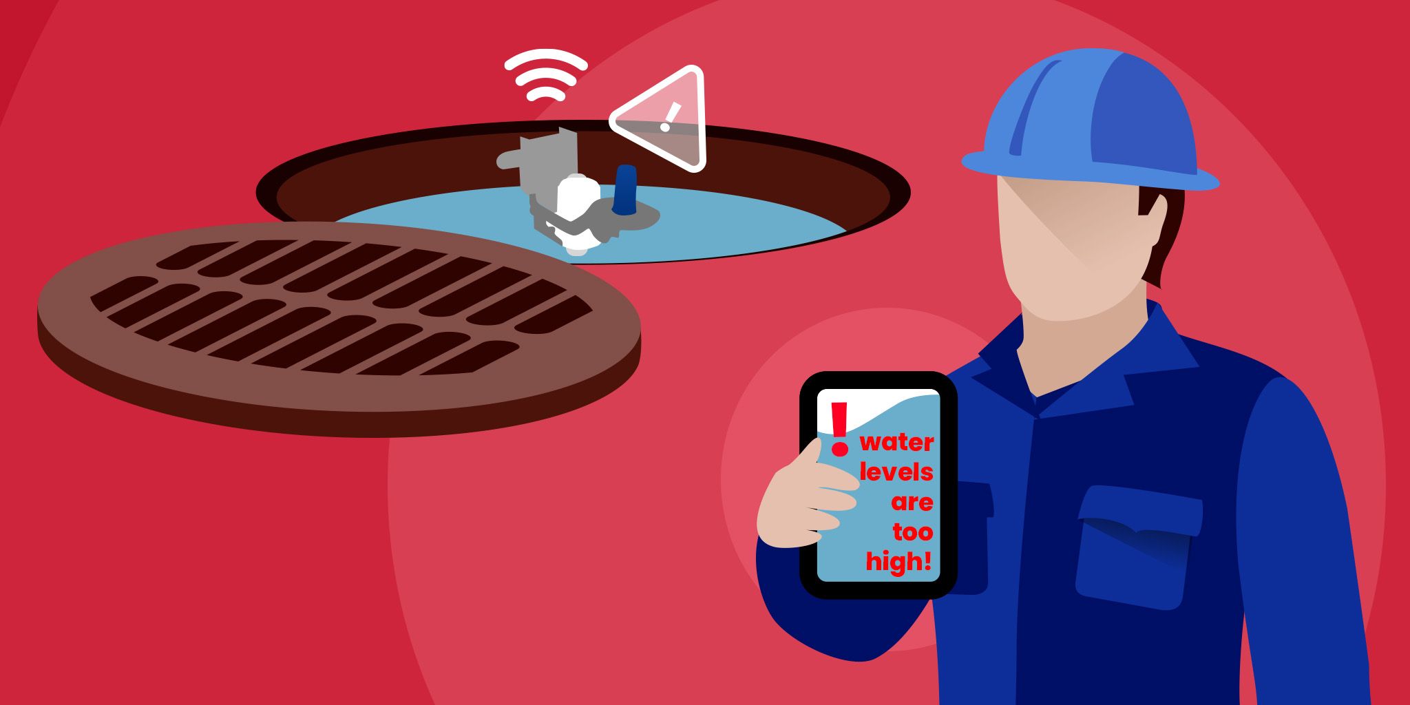
Sewer Level Monitoring
Real‑time sewer level data and early alerts to prevent overflows, prioritize maintenance, and proactively manage networks.
Real‑time sewer level data and early alerts to prevent overflows, prioritize maintenance, and proactively manage networks.
Kallipr
Kallipr
Asset Performance Management for Manufacturers
Monitor, manage, and optimize your equipment with real‑time health checks, predictive maintenance, and lifecycle tracking.
Monitor, manage, and optimize your equipment with real‑time health checks, predictive maintenance, and lifecycle tracking.
IoT83
IoT83
Related Solutions
Healthcare
Emergency Department Workflow Management
Gain a complete view of patient flow, staff activity, and resource availability to reduce wait times, improve satisfaction, and optimize throughput.
Vizzia Technologies
Utilities
Sewer Level Monitoring
Real‑time sewer level data and early alerts to prevent overflows, prioritize maintenance, and proactively manage networks.
Kallipr
Manufacturing
Asset Performance Management for Manufacturers
Monitor, manage, and optimize your equipment with real‑time health checks, predictive maintenance, and lifecycle tracking.
IoT83