6 Mistakes to Avoid When Designing Maps for Your Apps
6 Mistakes to Avoid When Designing Maps for Your Apps
- Last Updated: December 2, 2024
Guest Writer
- Last Updated: December 2, 2024

Have you wondered why every app you try to open today asks you to enable location access? Everyone out there wants to know where you are, though not in a creepy way – we hope. Similarly, gone are the days of asking for directions. No matter where you have to go, you open the map and check it out even before you leave the house.
And how often have you spent the better part of an hour just fiddling around with maps, trying to get a figurative view of where you are and where everything else you know around you is.
Let’s face it, maps are just everywhere. We use them and need them, all. the. time. No wonder Google Maps is the most used mobile app in the world.
However, despite some truly remarkable innovations that have made maps an indispensable part of our mobile experience, almost every map-based app out there has something left to be desired. Extensive usability testing is required to make sure you gain a nuanced perspective of every usability issue that can happen when using a map on a mobile screen.
Small screens, fat fingers, slow networks and a number of other contingencies need to be accounted for and an extremely effective design needs to be implemented to truly make your in-app maps usable.
So here are a few easy-to-miss details that you must pay attention to when designing maps for mobile:
1. Scrolling and Panning Problems
When I want to scroll, the map begins to pan. When I want to pan, the map zooms. Swipe ambiguity is a major reason most users have a hard time using in-app maps. It used to be easy on the desktops, just press, hold and drag the mouse to pan the map, or scroll away without a second glance. On mobiles though, things get a little more difficult.Most often, an average 5-inch mobile screen just about holds the map, with little space left in the sides and the bottom. If a user wants to scroll down, pass the map and go over to the list of results or any other section of the page, the user tends to use the most common swipe-up-from-bottom-gesture. However, instead of scrolling, this gesture begins to pan the map. There often seems no way to figure how to stop the panning and start scrolling, or the other way round.
Designers can try to overcome this issue by providing a ‘gutter space’ at the sides of the screen, which the map doesn’t occupy and can be used by the users for scrolling. Alternatively, you can provide an option to hide the map, allowing users to skip straight to the list results.
2. Too Many Points Too Close Together
When a map is searched for queries like ‘Restaurants in Paris, You’ll probably see something like this.[caption id="attachment_6531" align="aligncenter" width="290"]

See how many little icons overlap each other here? Pin pointing a specific one out of all these would be a challenge for even the slenderest of fingers. It also doesn’t give a clear enough idea of how many options there are to choose from. Zooming in would solve the problem to an extent, but that would eliminate the outer results from the screen’s periphery, making it harder to make a comparative analysis.
Densely packed display of icons is thus another issue that app designers will have to work through. A good concise list result with relative mileage of each from a point of reference is the better way to do this.
3. Slow Networks Lead To Less Responsive Maps
Sometimes, zooming-in on a map does nothing. So you zoom again. By this time, the map is blown way out of proportion and everything is a blur. This is because due to slow network, your first zoom gesture took too long to respond.You thought nothing happened and zoomed again. When the network finally caught on, your map had been zoomed in twice, maybe thrice. You try to zoom out, but it’s taking its time again, making you wait longer. So what should have been a second’s job has now taken far too many.
It is important to design your maps in a way that allows users to zoom smoothly even on low-speed networks.
4. Simple UI and Innovative Gesture Controls
At the moment, the only two major gestures commonly used are the swipe and the pinch. It is however possible to make innovations and take things to the next level and create more effective gesture controls for maps. For the moment though, keeping your UI as simple as possible is important to let users effectively navigate through apps.5. A Better ‘Near Me’
It happens all the time that we Google ‘Restaurants Near Me’ and end up receiving results for a restaurant that, though popular, is over five miles away. Locators aren’t always doing a good job of filtering results to show places near me. There should be a provision to specify a radius, so the map can show relevant results within that radius.6. Provide an Easy Out
While this is a general rule that applies to all UX design, no harm in reiterating it in context of maps. For users who wanted to try out a map interface but are now just about done with it, be sure to provide an easy way to exit the map and return to a simple interface. Also, use visual aids, prompts and examples to explain areas and gestures that need explanations. In short, just do whatever it takes to make users’ lives simple.
Wrapping Up
Maps are an extremely significant part of our mobile experience and with an increasing number of businesses using location-based data to provide information, special offers and customized service, the demand for quality map-based apps is only going up. Quite obviously, so is the competition.It is better to not have a map than to have a badly functioning map. The above pointers will help you avoid the common problems that plague maps usability on mobiles so that you can design a great map app.
Written by Almeda Brooks, a freelance writer for MoveoApps.
The Most Comprehensive IoT Newsletter for Enterprises
Showcasing the highest-quality content, resources, news, and insights from the world of the Internet of Things. Subscribe to remain informed and up-to-date.
New Podcast Episode

IoT Is Finally Delivering
Related Articles


Related Solutions

Food Safety Monitoring
Ensure food safety and eliminate manual processes with automated compliance and food condition tracking.
Ensure food safety and eliminate manual processes with automated compliance and food condition tracking.
SmartSense by Digi
SmartSense by Digi
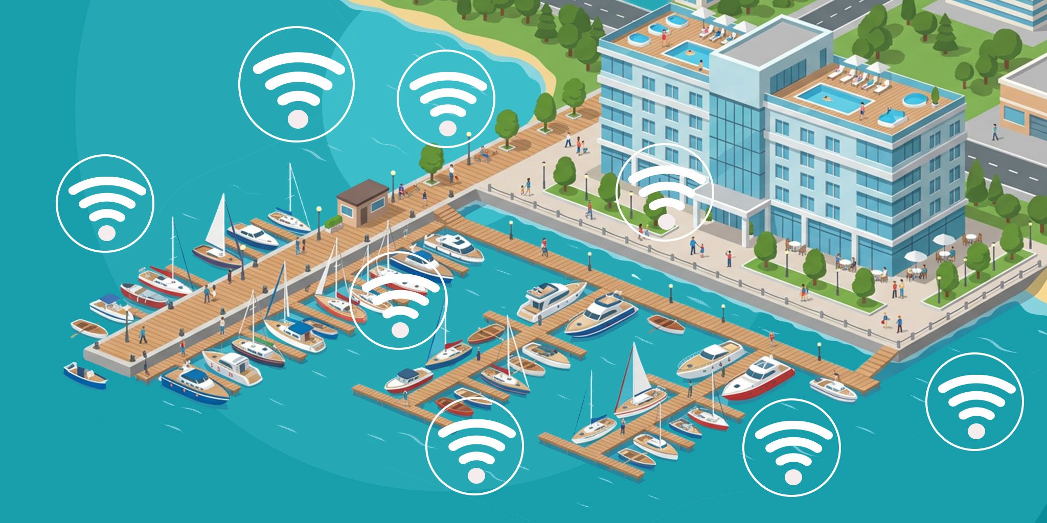
Smart Marina Management
Real-time visibility into marina assets, utilities, and security. Monitor, manage, and monetize marina resources more efficiently.
Real-time visibility into marina assets, utilities, and security. Monitor, manage, and monetize marina resources more efficiently.
Smarter Technologies
Smarter Technologies
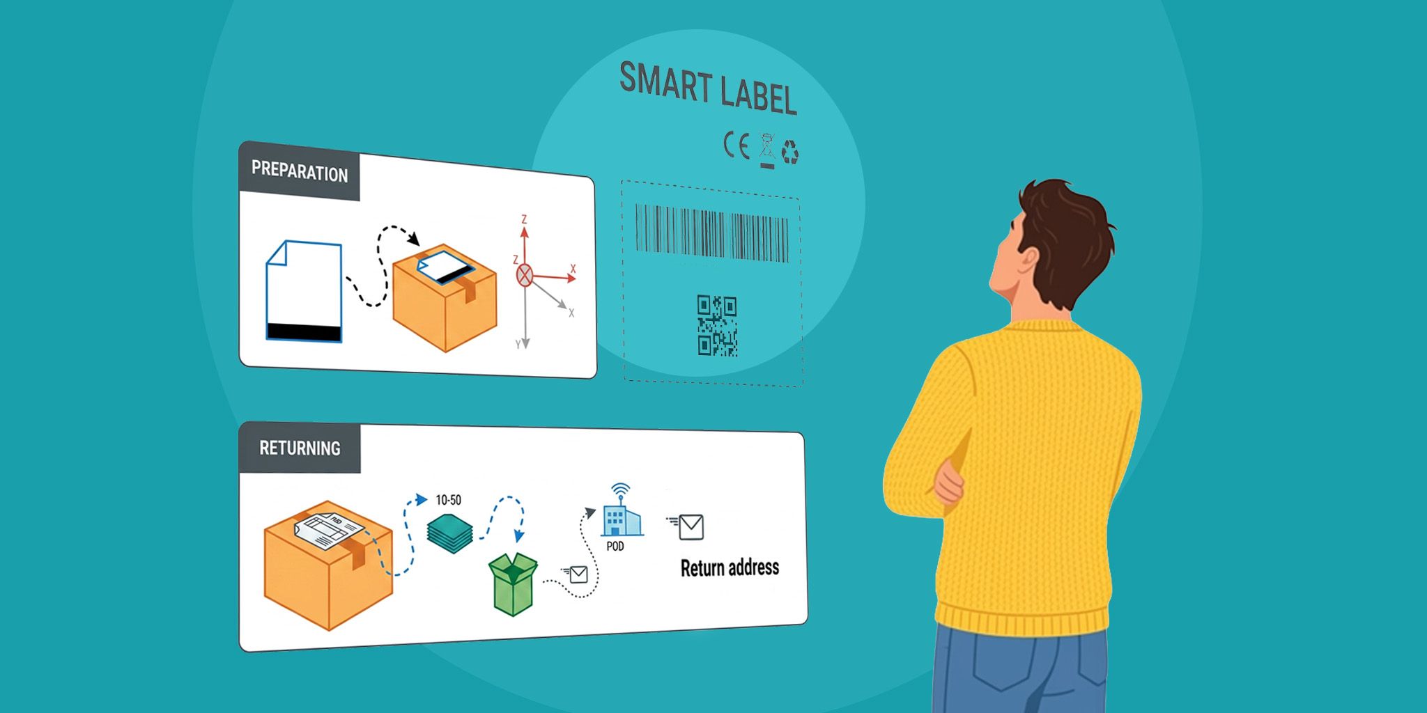
Smart Shipping Label for Supply Chain
Easy-to-deploy shipping label that provides real-time visibility into location, condition, and handling to reduce damage and optimize logistics.
Easy-to-deploy shipping label that provides real-time visibility into location, condition, and handling to reduce damage and optimize logistics.
SODAQ
SODAQ
Related Solutions
Retail
Food Safety Monitoring
Ensure food safety and eliminate manual processes with automated compliance and food condition tracking.
SmartSense by Digi
Maritime & Boating
Smart Marina Management
Real-time visibility into marina assets, utilities, and security. Monitor, manage, and monetize marina resources more efficiently.
Smarter Technologies
Supply Chain & Logistics
Smart Shipping Label for Supply Chain
Easy-to-deploy shipping label that provides real-time visibility into location, condition, and handling to reduce damage and optimize logistics.
SODAQ