Skeuomorphic Design For Connected Home Interfaces
Skeuomorphic Design For Connected Home Interfaces
- Last Updated: December 2, 2024
Guest Writer
- Last Updated: December 2, 2024

Skeuomorphic design: you may not know it by name, but if you’ve used a computer or smartphone in the past couple of decades, you’ve seen a lot of it. In short, skeuomorphic design is the act of simulating the look and behavior of physical objects for digital interfaces, everything from a toggle switch that can only be off or on to more complex items like dials or sliders. It was everywhere in smartphone interfaces until around 2013 when it suddenly fell out of favor. This hard-to-spell design style's demise was partially an aesthetic one, but understanding its origins provides the key to why it’s ideally suited for IoT interfaces, particularly connected home devices.
Why Use Skeumorphic?
Taking a look back at where skeuomorphic design for digital interfaces originated brings us to where most foundational graphical user interface paradigms were created: Xerox’s Palo Alto Research Center, more commonly known as Xerox PARC. There are plenty of places to learn more about these formative years for modern computing that all took place at a research center set up by a photocopier company in the 1970s, but I’d recommend starting with the fantastic 1999 book “Dealers of Lighting: Xerox PARC and the Dawn of the Computer Age” by Michael Hiltzik.
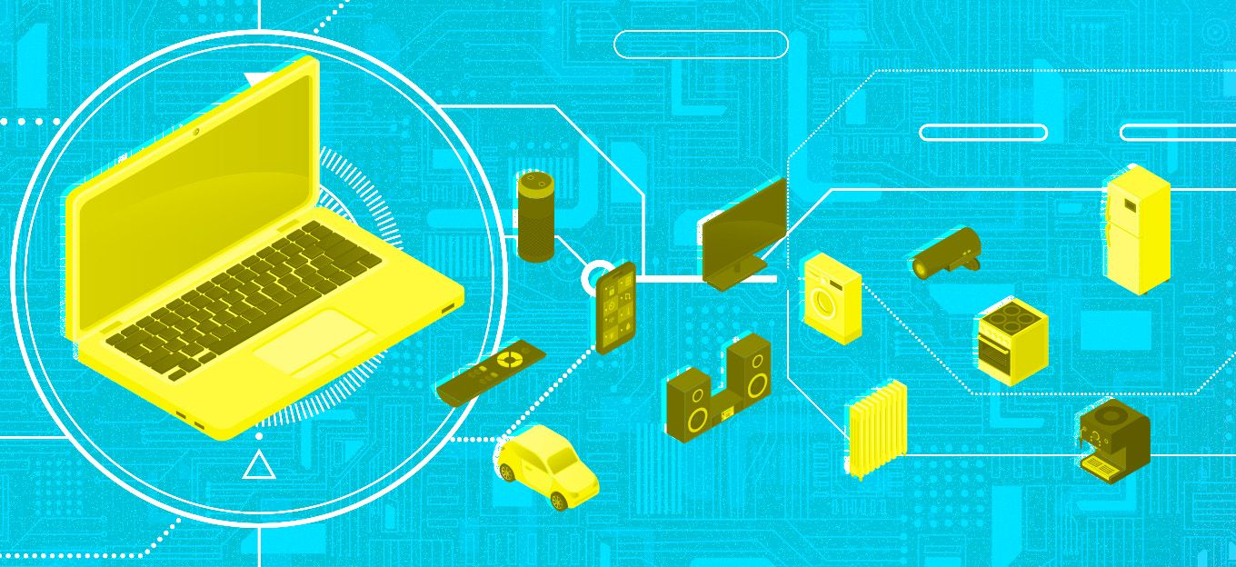
Take a look back at the history of skeuomorphic design for computer interfaces and why it's perfectly suited to creating intuitive interfaces for IoT and connected homes.
In short, when the engineers at Xerox PARC set about inventing the user interface for a networked computer system for a new generation of office workers, they knew that the command-line interfaces that drove computers at the time were way too intimidating for the average person. Although groundwork had been laid for graphical, not text-based interfaces by others like Doug Englebart going back as far as the 1960s, the interface for the PARC’s first computer, the Alto, was groundbreaking in ways that seem painfully obvious now. The addition of a pointing device, a mouse, in this case, opened up the ability to let the user “touch” and interact with elements on the computer screen in ways that mimicked our real-world experiences. In a world full of text-based interfaces showing green text on a black screen, PARC’s designers took this a step further and created a black-on-white screen that resembled a blank page of paper and populated the interface with skeuomorphic elements like clickable buttons and file folders that could be opened to reveal their contents.
Documents were no longer just cryptic names in a long text-filled list but visual representations of pieces of paper on the screen. One of the key things the engineers at Xerox PARC were acutely aware of was the transitionary nature of what they were doing. Most people had never interacted with a computer before, and creating an interface filled with familiar elements like pushable buttons and file folders would help smooth this transition from a standard 1970s office to something resembling the world we all currently experience with our computers and smartphones. Why the populace isn't using Xerox computers and smartphones is a longer story, and of course, all early home computers inflicted command-line interfaces on users. Still, these principals eventually found their way into consumers' hands via Apple’s Macintosh, Microsoft’s Windows, and countless other interfaces in the 80s and 90s.
Fast forward to 2007 with the first iPhone, where Apple went all-in on skeuomorphic design. The Camera app icon resembled a camera lens to the physical-style buttons and faux LCD display in the Calculator app liberally borrowed from Braun’s 1980s calculators, or the awful 50s-style TV icon for the YouTube app, the original iPhone OS was filled with designs that mimicked physical objects. There was a good reason for this—Apple saw the iPhone as a similar transitionary piece of technology as their original Macintosh desktop computers. If this would be many peoples’ first interaction with a smartphone, grounding its interface in familiar imagery and elements would create an easier transition into the next era of portable computing.
What Killed It?
In short, the iPhone was a huge hit. Despite all the conventional wisdom around how no one would use a smartphone without a physical keyboard, the touch-based interfaces for the iPhone and Android devices brought millions of people into the smartphone age. The transition was considerably faster than the adoption rates for previous technologies. This need for a skeuomorphic crutch to make basic functionality resemble physical objects quickly melted away. Additionally, functionality with no physical analog-like scrolling a social media feed quickly caused smartphone interfaces to mirror the ones on desktop computers in a few short years.
Apple’s devotion to skeuomorphism devolved into a purely aesthetic trend that arguably started to stray from its original goal. For example, how many people associate the green felt of a Vegas card table with the place they’d go to see their Angry Birds high score? This overuse inevitably led to the other, simpler, mortal blow to skeuomorphic design - it fell out of style. The change was swift— by the end of 2012, flat UI design was everywhere, and any interface or app that had any trace of the skeuomorphic design looked instantly dated.
Why Should We Look Again?
Connected home adoption is currently in a similar nascent, transitionary stage that personal computers and smartphones were when they leaned heavily on skeuomorphic design. To dismiss the concept on purely aesthetic grounds would be a mistake. More importantly, many of these items aren’t virtual replacements for physical objects—they actually are physical objects. As people make the switch to smarter, internet-connected devices in their homes and beyond, it’s important that designers don’t get let stylistic trends completely dictate their decisions and ignore the usefulness of creating interfaces grounded in their physical counterparts.
Designing interfaces that are instantly familiar, especially for smart home items that are replacing traditional ones with well-established controls such as light switches or remote garage door openers, can provide a more shallow learning curve for new users. Additionally, starting from a traditional, physical interface helps simplify and de-clutter the experience, highlighting the core functionality. Unfortunately, many smart products and interfaces currently fall into the trap of trying too hard to put every shred of smart functionality front and center, often burying or obscuring the core functionality. Think of the worst excesses of huge 1980s remote controls with dozens of buttons whose main purpose was to represent all the functionality of a device vs. the simplicity of the standard directional pad and play controls most smart TV devices have adopted.
Skeuomorphic design doesn’t have to involve slavishly modeling every aspect of a physical object. However, the instant visual recognition of a switch being turned on or a slider that displays its value in ways that mirror the traditional, non-smart devices are powerful tools for designers. For all of the smart software inside, the simple genius of Nest’s original thermostat was that anyone who’d used a standard Honeywell thermostat since the 1950s already knew how to adjust the temperature in their newly-smart home. The Nest smartphone app interface mimicked this simplicity without resorting to a 3D rendering of a thermostat. This familiarity eliminated the intimidation that often accompanies interacting with new technology.
The starting point for any good UI that seeks to extend or replace a physical device's functionality should be the traditional counterparts that, for better or worse, are familiar and comfortable to most people. Users shouldn’t have to menu-dive to open a garage door, set the alarm, or water their lawn. Ignoring the muscle memory, we collectively have for turning a thermostat dial or dimming a light will only slow down this transition to smarter homes.
The Most Comprehensive IoT Newsletter for Enterprises
Showcasing the highest-quality content, resources, news, and insights from the world of the Internet of Things. Subscribe to remain informed and up-to-date.
New Podcast Episode

Can AI Design IoT Hardware?
Related Articles